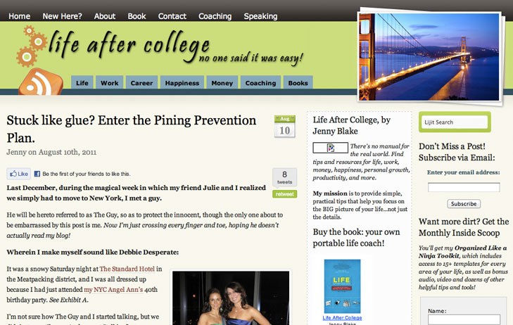
Today is a VERY exciting day. If you're reading in a feed reader, pop on over to the blog to check out the fancy new digs! I've had the same logo and tagline since 2005 when I first set-up this website -- that's SIX years! To say that I've outgrown it is an understatement ("No one said it was easy" -- c'mon, I can do better than that). I feel like my blog and I (yes, we're basically imaginary friends now) just moved into a mansion after living in a nice comfortable house that we had outgrown.
Thanks to the incredible Nina Cross (@crossnina), I'm thrilled to reveal a major site overhaul today, including:
- Completely new design that matches my book's branding. The tagline actually means something to me -- it's the impact I want to have on other people through my writing: to help people of all ages "Wake up. Live big! And love the journey."
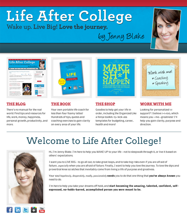
- A landing page with four clear options so that people can "choose their own adventure" (I've gotten a lot of feedback that my current blog landing page can be overwhelming for newcomers)
- Category landing pages that lay out a clear roadmap for each section so that people know where to start with my 4 years of archives
- Simplified sidebar -- one column instead of two, far fewer options to get distracted by. I also added in some "As seen in..." social proof icons
- A Store + Freebies page to hawk some new wares -- I'm trying to get creative about packaging my existing content and ideas to be helpful to you AND to pay the bills in post-Google life :)
- I moved to the Thesis theme to help with SEO, customizability, and to clean up some of the clutter from my existing (free) theme. At first I resisted because I didn't want my site to look like every other Thesis blog, but Nina did a great job personalizing it, and the benefits of using Thesis were too great to ignore.
This upgrade has been a long time coming...
There have been so many things that I've wanted to do here over the years, but never felt like I had the time, focus or energy while working full-time.
With Nina's help, I've finally been able to implement my vision for the direction this site can go. I've been wanting a site design that is friendly, easy to navigate, inviting, and ridiculously useful. The category archives alone could provide tons of value to new visitors -- if only they were easier to sift through -- so I wanted to make sure they are well-organized and laid out in a way that focuses on the user (not just reverse chronological order).
I also FINALLY added a newsletter freebie (should have done this years ago). My templates are no longer available from my top navigation -- I'm giving them away as part of a kick-butt "Organized Like a Ninja" toolkit in exchange for signing up for my Inside Scoop mailing list.
Curious about what the site used to look like? Life After College through the years...
It started with the HTML version I built in 2005 (notice the "we've" in the second paragraph? I didn't want anyone to know it was just a 22-year-old behind the curtain...too funny!):
Then I gave it a face-lift in 2008/2009 by upgrading to a free WordPress theme that I customized (here's the very first blog post I wrote, when I had zero subscribers. Note to future bloggers: best to create an archive of posts FIRST, then announce to friends and family):
Drumroll please....the new site!!
The brand new "choose your own adventure" landing page -- (people clicking over from email/rss/social media will still go directly to the blog page):
I'm beyond excited to keep building out this site as I continue to grow into my business, and as always, I welcome your feedback at any time!
For any of you looking to upgrade your own sites, Nina Cross is an absolute pleasure to work with. She was able to read my mind and translate my vague descriptions into something beautiful; she was responsive, took feedback incredibly well, and handled every step of the process professionally. Big huge thanks to Andrew Norcross for his WordPress ninjary too -- to call him the hero of the blog community would be a massive understatement -- he has come through for me countless times, and this launch was no exception. There aren't enough words to thank him properly...
So wherever you are, let's lift a virtual cupcake and toast Nina for doing such a fantastic job!


